COMPUTER
Paris Metro Catch22
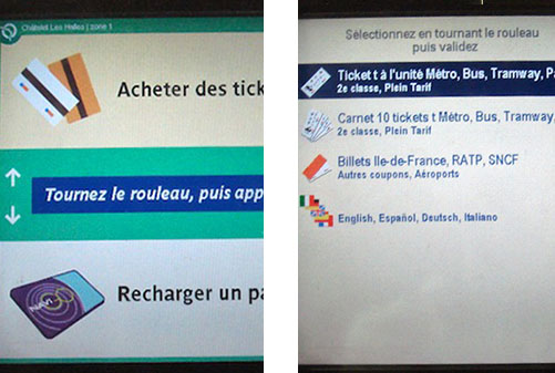
Paris gets a lot of tourists every year so you’d think their automated metro ticket machines would be slightly friendlier to folks who don’t speak French. When you first walk up to the machine, you’re met with a French welcome screen (left). No language-picker button UNTIL you choose a menu option in French and arrive on the second screen. Who designed this? To be fair, this system was likely dead in the water in terms of design environment:
- My guess is that the two screens were designed by separate teams with no one to sanity-check or unify the experience as a whole.
- This a great example of ‘you are not the user’. The designers in charge simply don’t know what it’s like to not understand the language. On second thought, there probably were no designers on staff.
- There is no chance for real user feedback. When tourists are confused, they either 1. ask a local who has no one to complain to, or 2. ask a metro operator that feels no responsibility for the system as a whole and is part of a large bureaucracy that doesn’t encourage bottom-up communication.
C’est la vie.