HUMAN COMPUTER

Software Design & Product Management

Psychology

Interfaces & The Mind: An Introduction

I was at a get-together recently when someone dropped the question: “so what do you do?”   I paused for a bit before revealing that I design software – half to gather my thoughts and half to take one last sip of my drink before the unavoidable follow-up questions.  Software design?  Do you make icons and stuff?  Do you have to be really good at computers?

I spent a few minutes talking about how I work with people to identify problems, come up with features, apply psychological principles to make intuitive interfaces, and so on.   It’s very well rehearsed by now and always tends to leave people with a very intrigued look on their face.   A few minutes later, my new friend insisted on introducing me to a few friends.  We walked over, shook some hands.  She then went on to introduce me as her “new programmer friend.”  So much for that.

Software design is a misunderstood field. And rightfully so.  It’s relatively new, it’s a niche inside a niche, and it’s highly multidisciplinary.  You can’t really go to school to major in software design.  The software designer is sorely missing from the typical lineup of firemen, scientists, and doctors in children’s literature, so  it’s no surprise that people simply remember ‘programmer’ – they have no prior schema to relate it to.

This multi-part series of posts intends to introduce software design from a slightly more approachable angle – that of psychology.  In the posts to come, I’ll be talking about how things like working memory, visual attention, and other brain processes affect the way we make sense of and interact with software interfaces.


From Stovetops to Tablets

Let’s start with something that has nothing to do with software. Look at these two stove top designs.

stove1stove2


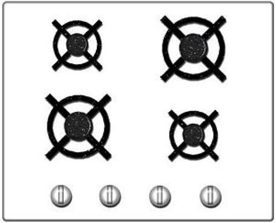
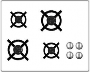
Which one would you prefer to own?  Price and other factors aside, the one on the right is clearly easier to use due to what’s called a ‘natural mapping’.  There is a clear analogy between the square configuration of knobs and the square configuration of burners, so turning on a specific burner is much easier.   Now take a look at the computer interfaces below.

programInterface1  programInterface2programInterface3


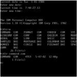
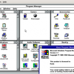
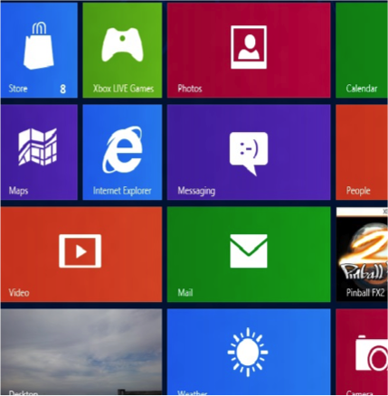
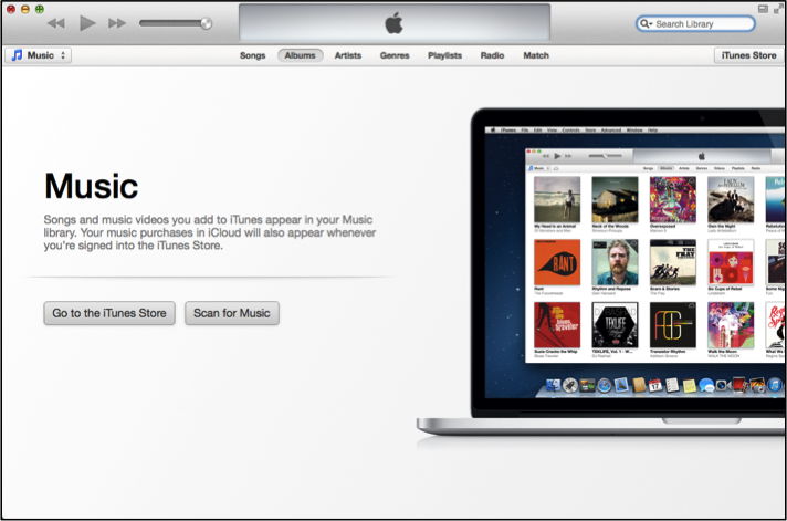
These should be somewhat familiar.  They represent the progression of user interface technologies over the last thirty or so years.  And there’s an analogy here:  just like each of the two stove interfaces above allowed a user to identify a burner and activate it, each of these interfaces allows someone to identify a program and start it up.  Certainly there have been some major leaps forward in stovetop and computer design.  Each one is a little easier to use than the last.  The interesting thing is that the key to improvement in both cases was lessening the gulf of representations.  You could say that the ‘better’ interfaces – whether stove or screen – required people to jump through fewer associative hoops.   To do less translating from one mental concept to another.   All of which ultimately lessens the burden on working memory.

The first, more awkward, stovetop interface has you jump through (at least) two associative hoops.  First of all, you have associate a plastic knob with a burner and the act of turning it with the concept of starting a fire.  It’s obvious today, but if you were to bring along a time traveler from the 18th century and stand him in front of the stove, their first instinct would likely involve touching the burners themselves.  Second, and more relevant, you have to associate a line of knobs with a square of burners.  Likewise, with the first command line interfaces, turning on a program involved a few steps of implicit mental acrobatics.  First you had to identify a program – for which you had to decode a line of text (often cut off, often involving a cryptic suffix like ‘exe’ or ‘bat’).  Once you had identified the program, you had to translate the action of ‘opening’ into a phrase involving words like ‘cd’ (which you mostly had to memorize).  Finally, once you had the proper phrase in mind, you had to translate that sequence of letters into keystrokes on a keyboard that (somewhat arbitrarily) threw the alphabet into a relatively unintuitive configuration.   The Windows 3.1 interface eliminated a few of these problems by allowing you to see pictures, which the visual system has an easier time parsing quickly, and by allowing you to do something akin to ‘pointing’ with your hand – something almost innately familiar.  I’m talking about the mouse, of course.  If you’ve ever watched an elderly person use a mouse, you’ve seen that it’s really not that easy.  Sure, the directional mapping is somewhat natural – up is up, down is down, and so on, but you still have to develop a sixth sense for how the speed of the mouse relates to the speed of the cursor.  It’s almost like learning to work with your fingers under a microscope.  Finally, touch interfaces came along and eliminated that associative gap too.    In the picture on the right of the Windows 8 interface, you identify an object using a large, prominent visual representation and then manipulate it by reaching over and touching.  Just like in real life.

The point here is that the same mental processes and constraints that apply to our understanding and manipulation of every day objects like stoves (or doors, or signs, or even people) apply to computer interfaces as well.  Computers are just the next generation of tools and environments that we, as humans, have begun to interact with.   One of the principal challenges of a software designer is to design tools in a way that takes into account human psychology – whether it’s hard-wired  such as motion detection in peripheral vision or commonly learned associations like the tendency to read from left to right or to assume that a mouse cursor in the shape of a hand implies interactivity.

In the same way that an architect elicits emotions like pride through certain materials and large spaces, or that a film director draws attention to an important detail by briefly cutting to the knife behind the murderer’s back, a software designer in many ways curates human attention as we  experience and explore virtual environments.

This is by all accounts only one part of software design.  I’ve left out any mention of the user research process, teasing apart implementation ideas from fundamental needs, understanding context, validation, aesthetics, and a host of other important things – but this, to me, is the fundamental and unique thing that design brings to software.  This is the angle that makes software design approachable and relatable to people outside (and even inside) the world of technology – distinguishing it from pretty pictures, from programming, and from business concerns.

In the next part of this series, I’ll delve into working memory and some of the ways that it can be applied to software design.

Interface & The Mind: Working Memory

In my previous post I wrote about software as being nothing more than an advanced human tool that is subject to the same basic psychological processes and constraints as other objects that we interact with – from working memory and emotion to long term memory and visual perception.  This series of posts will step through each of these processes one by one, explaining how they affect the interaction between humans and their environment (with a focus on computer interfaces of course), and how these principles can be – and have been – used in interface design over the years. There’s no better place to start than working memory.  Working memory is often referred to as your auditory/visuospatial scratchpad.  It’s the part of your mind that lets you keep a new phone number in mind as long as you repeat the digits to yourself over and over.  It’s also the part that lets you mentally rotate an imaginary shape or make sense of a song as you listen to it.  If you’re a computer person, think of it as your RAM.   Just like RAM, it has a finite capacity, requiring you to load and unload things – something that basically amounts to switching attention from one thing another.  If something distracts you while you’re putting that new phone number into your contacts list, you end up forgetting the number.  The capacity really varies from person to person and, more importantly, based on things like energy level, stress level, emotional state, and so on.   So given that working memory is heavily involved in parsing interfaces and problem solving, anything that stresses out or overwhelms a user – including bad error messages, baroque layouts, and unresponsive interfaces – can essentially make the user … dumber … and less able to interact with his environment.

Let the user focus on his task by minimizing shifts in attention

Here’s an example of an interface I was recently asked to review.   If you’re particularly passionate about UX you’ll notice all sorts of things that could use help here – and you’re right.  Perhaps one day I’ll devote an entire blog post to just this interface.  But for now, focus your attention on the division between the top graph and the bottom graph, as we’re going to be talking about how the user is repeatedly forced to shift attention between the two.

mentalram1

The UI actually accomplishes a very simple task.  What you’re seeing are the results of a simulation between a molecule and a protein over some period of time.  The different ‘segments’ of the protein are listed on the vertical axis, the time is listed on the horizontal axis, and the little colored dots in the middle represent the number of interactions between the molecule and a certain segment of the protein at a certain point in time.  The horizontal line graph at the very top represents the vertical summation – that is, the number of interactions across ALL SEGMENTS of the protein at a certain point in time.   How about the bottom bar graph?  Well, that represents the horizontal summation – so the number of interactions across ALL TIME for a specific protein segment. So what’s wrong with this interface?  The problem is that users often compare values from the top graphs with those in the bottom graph.  And every time they do that, they have to load into working memory some information (the name of some segment they care about, perhaps the color coded value) and then, while repeating that information to themselves over and over (just like a phone number), search through the bottom graph to find the corresponding segment (each horizontal label here corresponds to a vertical label in the top graph).  Then compare values.  Then go back to the top.  Then rinse and repeat.   And this is something that happens often enough that it gets in the way of the actual task. You can probably see where I’m going with this.  Here’s a revamped UI:

mentalram2

Here we’ve moved and rotated the bottom bar graph to the right side of the top graph.  We’ve made all sorts of other little changes, including floating red ‘tracking lines’ to help you keep track of each row and column and bar styling at the top for consistency’s sake, but the two important things here are that

  1. The user gets a quicker idea of how these graphs all relate from the getgo
  2. (More importantly) The user doesn’t have to switch attention from top to bottom, from holding values in memory to matching segment labels in two different graphs.  They can simply move their eye from a segment label to the far right of the graph, the same way that they moved their eye from a time label to the far top of the graph.  This lets him stay focused on comparing values, finding patterns, and  developing insights.

You’ll always want to ease the most repetitive and common tasks as those are the most likely to create bottlenecks in the larger workflow.  Note that this is contingent on knowing your user and his problems intimately.  Without clearly defining your problem, you can’t validate your solution.

Manage attention through visual groupings

So it’s all fine and good to help the user stay on task and focus on one part of the interface, but how does the user actually parse an interface – especially the first time it’s presented to them?  Ultimately when you look at a screen, or a poster, or even just a room, the early stages of visual processing in your brain sense only a great deal of disjoint lines, colors, perhaps shapes, and so on.  Enough, in fact, that it can be relatively difficult to keep track of all of them – to pay attention to or grok what’s in front of you.  While 70 lines of text and 20 buttons can overwhelm your working memory system, five to nine groups that neatly relate these elements to each other and help abstract the interface are much more manageable. You can help the user make sense of a complicated interface with many things going on by taking advantage of the fact that the visual system classifies things based on similar features.   Take a look at some of these familiar interfaces and how they use some common Gestalt laws of grouping.

chunking1chunking2chukning3

  • Relative distance:  Notice in the Google News interface on the far left that the distance between article titles and sources (USA TODAY) is much smaller than the one between articles, which is much smaller than the one between sections.
  • Color:  Without even reading labels or captions, you know that the blue things in the Google News interface are similar to each other and different than the non-blue weather pictograms below.
  • Shape & Size:  How about the Google Chrome interface in the middle?  There are a lot of buttons at the top.  Still, they’re relatively manageable.  Three of them are colored – they must form a group.  There are a bunch of flat-pyramid-looking-things on the right of that which can all be grouped together as well, and then there’s a big white rectangle below which is clearly separate from everything else.
  • Common backdrop:  The top of the Yelp interface includes all sorts of text, an input box, and more, but users don’t have to read every little link before realizing that  they all have something in common – they’re navigation elements.  This way, the user can mentally skip this and move on to the next area with a common backdrop, which happens to be the content of the page.

These are obvious.  It’s hard to think of anyone not taking advantage of rules like this, but you see it all the time.  Often the mistake is not in failing to communicate relationships by using these principles, but in unintentionally succeeding in communicating misleading unintended messages.  One semi-recent addition to the New York City subway is a system of electronic signs that list how soon the next train is coming.  When the projected time is under a minute or two, the text turns red.  Unfortunately, red is also the color associated with the 1,2,3 trains.   This makes for frequent slips of judgement, especially when users are daydreaming and otherwise not devoting their full attention to the sign.


Curate attention by using size and color to communicate importance

Even if you’ve helped the user understand and manage what you’re showing them by grouping things into fewer concepts, there’s still the question of what they ought to look at first.  And that’s an important question, because oftentimes it determines whether they’re going to stick around and how they’re going to conceptualize and remember the experience on every subsequent visit.

This is where size and color can really make a difference.  Certainly any of the rules discussed above can also work – the point is to selectively apply unique characteristics.  Take a look at some examples

vizhierarchy1


ITunes provides a big “Music” label and two prominent buttons in the middle of the screen.


vizhierarchy2

The Twitter interface greets you with a giant blue button – unlike any other button on the page.  When you notice its color, your eye also notices the few other blue things on the page (top right and top left) which happen to also provide important high-priority functionality.

vizhierarchy3


 My favorite example.  Google’s Gmail web email client offers a great deal of functionality.  The most important, though, Send and Search are colored blue and red to catch your eye from the moment you first see the page.

Interface & The Mind: Long Term Memory

In the previous two posts, I talked about how basic psychological processes underlie human interactions with software and delved into some detail on how working memory affects interactions.  In this post, I’ll be talking about long term memory.  To continue with the analogy to computers, if working memory is RAM, long term memory is the hard disk – and a pretty fancy hard disk at that.  While working memory has finite capacity, long term memory (by most accounts) doesn’t seem to have such limits – either that or we haven’t come up with good ways to measure it.   Information from your senses is perceived and attended to by working memory and often, with some rehearsal, ends up in long term memory.  You learn.   On the flip side, everything you perceive is ultimately (consciously or unconsciously) colored by what’s already been stored in long term memory – and often anchored using small unexpected cues.  When meeting a stranger, you might make some assumptions about them because their voice sounds similar to that of someone else you know.  Likewise, when you see a narrow white rectangle with an inner shadow on a screen, you assume it’s meant for typing because repeated prior exposure has led you to that association.

A few factors help people learn.   Among them:

  • Rehearsal
  • Presenting information when it’s immediately relevant and needed
  • Presenting information in a top down manner so that relationships between different concepts are clear
  • Relating the information to things that people already know

You can take advantage of these principles to help people better understand high level concepts in your software, better retain interfaces, and better make sense of what’s placed in front of them.


Minimize the Object-Action Matrix

Consolidating concepts will go a long way toward helping people learn.  English is known to be a notoriously hard language to master because of the number of exceptions in its rules of grammar and syntax.  When you’ve learned the rule for conjugating a certain class of verbs, you’ll be surprised to find out that the rule doesn’t apply to a few words within that class.  The fewer exceptions, the easier to learn.  It’s the same with software.  Imagine making a table like the one below, with the list of ‘concepts’ or ‘entities’ on the left side and the list of things you can do to them across the top.

matrix

The larger this table, or the more sparse the distribution of X’s, the harder your software will be to learn.  The more rules and exceptions users will have to learn, and the more assumptions they’ll mistakenly make about applying prior knowledge to new features.  The denser and more compact the table, the more people can use understanding of prior features to master other features.  This is especially useful in complex applications because, by definition, they require a great many features.  Take a look at the following examples:

matrix_photoshop

The concept of Layers is one of the cornerstones of Adobe Photoshop, with the Layers Palette (pictured above) taking a prominent place in the interface.  People have, for a very long time, understood what can be done with layers – they can be created, deleted, reordered, toggled, opacity-modified, named, and so on – and how to do each of those things.  Photoshop is a large and complex piece of software, though, with many new features added every release.  So how does Adobe keep from overwhelming their users?  One very clever tactic so far has been to consolidate many new feature concepts with the concept of a layer.  Many features, from Groups to Effects to Shapes to Channels and more, simply take the form of layers and – therefore – receive the same familiar capabilities and access points.   No introduction is needed.  Without prior exposure to an Adjustment Layer (an effect), you already know how to turn it off, toggle it, delete it, change its strength, and so on.


matrix_facebook

Now for something more familiar.  Above is the Facebook Albums interface.   Notice that one of the built-in albums is called “Profile Pictures.”  Back in the early days of Facebook, you uploaded and managed your profile pictures in the Accounts section of the site.  When Albums were added, people slowly became accustomed to using the Albums interface to add, delete, and tag photos, write captions, and so forth.  At that point, Facebook made the wise decision to unify the concept of a profile picture and a regular photo.  Whatever you’ve learned about managing regular photos you can apply to managing profile photos.


matrix_logicOne last example to drive the point home.   Above is the a screenshot of the (very complicated looking) Mixer interface for Apple’s Logic music production system.  Each one the vertical bars represent what’s called a ‘Channel Strip’ – an entity that typically represents an instrument and allows you to create, delete, add effects, send the audio output elsewhere, and change the volume and panning.  Just like Photoshop, Logic is a very complex piece of software and includes not just instruments but audio effects, imported mixes from other software running in parallel, and a “Master Output” that mixes everything down into one ready-to-export song.  That’s potential for a lot of UI exploration and learning.  Fortunately, Eeery single one of these concepts, and more, are handled through Channel Strips.  That way, you can take several instruments, ‘send’ them to one group Channel Strip, which you can then send to an effect Channel Strip, which you pan and silence in the exact same way you’ve done for instruments previously.

You get the point.


Facilitate Rehearsal through internal & external consistency

Much of this post ultimately boils down to ways of facilitating rehearsal without the user having to go out of his way to commit things to memory.  The section above, in some sense, dealt with consistency in expected features.  This section deals with defining standards for look and feel – both internally (within one piece of software) and externally.  The latter is especially important.  No interface exists in a vacuum.  Your users may be accustomed to the way that Microsoft Word organizes its menus and will therefore make assumptions about where to find it in your software.

consistency_twitter

consistency_googleapps

The first image here shows the Twitter front page.  Notice how they make use of the “@” and “#” symbols even in their site’s top navigation menu to help users form stronger associations.   Below it is the top right of every single Google App interface.  No matter which Google tool you’re using, you’ll always see “Comments” and “Share” (as well as your profile settings) at the top right.  No exceptions.   Every time a user sees this, it reinforces their learning and makes them even more confident and comfortable with Twitter and Google products.

consistency_bubble_facebook consistency_bubble_apple consistency_bubble_google

How about external consistency?   Just like spoken and written language, UI conventions and visual vocabularies often have new conventions added.  And just like with language, where a certain sound is associated with a meaning or function, a UI element with a recognizable visual form is assumed to behave like similar looking elements.   To put it simply:  If it looks the same, it ought to act the same.   The concept of a red notification bubble spread from Apple to Facebook to Google.

consistency_at_twitterconsistency_at_facebook consistency_at_hipchat

Likewise, the “@” symbol became a way to single out or target a specific recipient in a message.  This went from (left to right above) Twitter to Facebook to HipChat.

Consistency helps people rehearse things and make use of prior learning.

In the next post, I’ll talk about the value of Just-In-Time-Help and presenting information to users when it’s immediately relevant.