HUMAN COMPUTER

Software Design & Product Management

Too much bounce in my step for Google Maps

Overenthusiastic feedback UI

Here’s one on the value of knowing your audience and doing some real in-the-field testing.

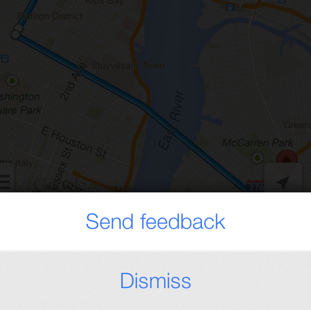
Like everyone else, I was excited when the Google Maps for IPhone app came out.  Pedestrians especially flocked to it  since public transport directions had been taken out of Apple maps.   Great features overall…except for one thing.  When you shake the phone, you get a “Send feedback” UI.  An exotic and innovative entry point, for sure, but perhaps it’s a little risky given that many of its users are pedestrians…who like to walk fast…which involves shaking.

Long story short:   Maybe I have too much bounce in my step or maybe the IPhone accelerometer is too sensitive, but I get this screen constantly while I’m trying to find my way through the city.  It’s really very intrusive.    But hey, if I ever want to complain to Google about this, I’ll know where to go!


NY subway color confusion

If you’ve been to New York City in the last few years, you’ve probably used one of these signs to figure out how long until your train arrives.  It’s really pretty convenient.  The one problem I have with these signs has to do with the use of colors.  In some cases (the left shapes, for example), colors represent subway lines like 1, 2, N, Q, F, and so on.  In other cases (the text on the right), the colors represent how close a train is to coming:  green normally and red if it’s less than one minute until arrival.  There are two sets of people that this is likely to confuse.

  1. Tourists – as a tourist, you’re not familiar with all of the subway lines in the city.   Upon initial inspection, you may think that the green line is coming in 2 minutes and the red/orange line is coming is about to arrive.
  2. Preoccupied people – which basically applies to everyone ever in the subway.  When your’re thinking about your work day, playing with your phone, or whatever, it’s not unlikely that you would see red/orange text and believe it means the red line is soon approaching.  Even if you’ve used it a million times before.  People aren’t ‘all there’ – we’re often running on autopilot – and this is one instance where that autopilot would easily send you running down stairs prematurely or even into the wrong train.

Solution?  For one, you could make the top line flash on and off instead of changing color.  Or instead of coloring the entire line, just color the “0 min” part on the right.

The cPanel code editor ate my homework

Screen Shot 2013-07-31 at 3.04.10 PM

I’m embarrassed to admit that sometimes I use my host’s online cPanel code editor to make small modifications to my websites.   Perhaps I shouldn’t be though – I can’t be the only one. Here’s a use case that I bet is pretty common.

  • You make a website that you update once every few months.
  • You don’t use an IDE or FTP or anything like that, either because this isn’t a serious website or because it’s something you’ve managed for a while so the old FTP account you set up was on a different computer.
  • You’re in cPanel anyway because you’re managing your domain name or email preferences, so why not make some quick edits to the site’s styling?  In comes cPanel’s code editor.
  • You end up leaving the cPanel code editor browser tab open because you’re lazy or because you might make a change the next day and it’s hard to get back to it from the main site.
  • The next day, you click on the tab and spend a few minutes making modifications to your code.  Then you click “Save Changes”.  Suddenly the editor tells you that you were no longer logged in, takes you to a login page, and discards all of your work.

Yeah…this just happened to me.  Typically bugs that cause data loss are treated pretty seriously so I wonder why this has fallen through the cracks.

Takeaway:  don’t present a working environment when there is absolutely no way for someone’s work to persist.  Either tell me upon my first keypress that I’m no longer logged in or temporarily remember my changes while you verify my identity again.


The old split receipt trick

receipt

I recently went to dinner with a friend.  We asked if we can split the bill in half and this is the receipt I got for my half.  Notice that the suggested tip is based on the full price, not the half I was paying.  I caught this.  My friend did not – he was already halfway through leaving a 40% tip.  So perhaps Eataly is out to trick their customers?  More likely this is just a detail of how the computer transaction software stores and represents bills that no one ever bothered to look at.

Maybe receipt design isn’t the most worthwhile thing to spend time on, but these kinds of things happen all the time in software.  Some data structure or backend representation ends up creating a bug that no one really thinks about or notices because it wasn’t a use case to begin with.  Often, as in this case, the end result is an image of carelessness and a slightly less trusting customer base.